How to spot financial trends before they become a crisis
How to Spot Financial Trends Before They Become Crises
It's 3 PM on a Thursday when the finance manager knocks on your office door with bad news: there's not enough in the checking account to make next week's payroll! You're stunned. The budget showed you'd be fine. Last month's financials didn't raise any red flags. How did this happen?
This scenario plays out in nonprofit offices too often. Organizations operating lean don't have the luxury of robust reserves, yet most rely on backward-looking monthly reports that show where they've been, not where they're headed. Leadership learns of a problem when it’s knocking on their door rather than on the distant horizon.
The good news: you don't need a sophisticated finance team or expensive software to see problems coming. What you need is a simple dashboard that surfaces trends while there's still time to respond.
The Cost of Late Detection
When executive directors discover financial problems late, the consequences ripple through the entire organization. Programs get delayed or cut. Emergency board meetings get called, with all the organizational anxiety that entails. Funders start asking uncomfortable questions. Staff worry about job security. And you spend weeks in reactive mode instead of leading your mission forward.
Traditional monthly financial reports aren't designed to catch emerging problems. A balance sheet shows you a single moment in time. A profit and loss statement tells you what happened last month, but not what's next. We need these reports, but they're no substitute for good early warning systems.
The difference between a trend and a crisis is simply timing. A trend is a pattern you can see developing over weeks or months - something moving in the wrong direction, but slowly enough that you can intervene. A crisis is what that trend becomes when no one notices it until the impact is immediate. As an executive director you must have systems that give you time to act.
Five Critical Trends That Dashboards Should Surface
1. Cash Flow Trajectory
Cash is oxygen for nonprofits. You can have a balanced budget on paper and still run out of cash because of timing mismatches between when grants get paid and when expenses come due.
The metric to watch: days of cash on hand, tracked monthly over a rolling 12-month period. This tells you how many days you could operate if no new revenue came in tomorrow. For most nonprofits, 45-60 days is minimally healthy; 90+ days provides real breathing room.
The pattern that signals trouble: consistent monthly declines, even small ones. If you start the year at 75 days of cash and you're at 68 days three months later, that's a trend. Six months from now you could be in serious trouble. Seasonal dips are normal and expected - most nonprofits have predictable high and low points in their cash cycle. What you're watching for is the trajectory underneath the seasonal pattern.
Your dashboard should show this as a line graph with your actual days of cash on hand, overlaid with the prior year to show seasonal trends. Add horizontal threshold lines at your yellow flag point (maybe 60 days) and red flag point (maybe 30 days).
2. Revenue Concentration Risk
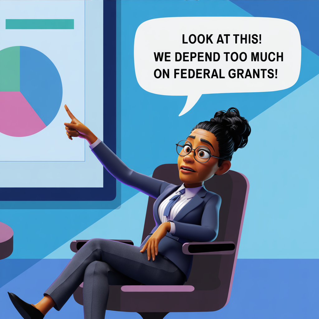
When one funder represents a growing slice of your revenue pie, you're building a vulnerability. If that funder changes priorities, experiences budget cuts, or simply decides to fund different organizations next cycle, your entire operation is at risk.
Watch for patterns where one revenue stream grows while others stagnate or shrink. This often happens gradually and almost invisibly - a major grant renewal increases by 20% while individual giving stays flat, and suddenly you've gone from a balanced portfolio to dangerous dependence.
Your dashboard element: a simple stacked bar chart showing revenue by individual source (government grants, foundation grants, individual giving, earned revenue, etc.) for the current year compared to the prior year. Calculate each source as a percentage of total revenue. If any single source creeps above 40-50%, you're entering risk territory.
3. Program Cost Creep
Programs can become financially unsustainable so gradually that no one notices until they're deeply underwater. Salary increases happen. Supply costs rise. Service demand grows. Meanwhile, the funding for that program hasn't kept pace.
Track program-level margins - the difference between what each program brings in (direct program revenue plus allocated funding) and what it costs to run. Not every program needs to be profitable. After all, there are certain things you just can’t monetize. But you need to know which ones need a subsidy and whether that gap is growing or shrinking.
Your dashboard should show program-level revenue minus expenses over time, ideally as a trend line for each major program. When you see a program's margin declining quarter after quarter, you're watching a problem develop. That's your signal to either seek additional funding for that program, find efficiencies, or make hard decisions about program scope before the situation becomes urgent.
Pro Tip: Conversely, sometimes you will see a program generating larger surpluses over time. At minimum, that’s cause for celebration. Frequently, that program may have lessons that other programs can benefit from and replicate.
4. Grant Pipeline Gaps
Most nonprofits operate on a grant cycle that creates natural ebbs and flows in revenue. The problem comes when your pipeline - the grants you've applied for but haven't heard back on yet - starts showing warning signs.
Two patterns to watch: declining total pipeline value, and increasing time between applications and awards. If your pipeline has historically carried $500K-600K in pending applications and you're looking at only $300K, you've got a gap that will show up in your cash flow six months from now. If grants that used to take 60 days to get awarded are now taking 90+ days, your cash cycle is extending.
Create a visual pipeline showing grants by stage (planning, submitted, under review, awarded) with expected decision dates and amounts. Update this monthly. The dashboard should show both the current snapshot and trend data - is your pipeline growing or shrinking compared to the same point last year?
5. Accounts Receivable
For nonprofits with earned revenue - clinics billing insurance, workforce development programs billing for placements, any fee-for-service model - accounts receivable can quietly strangle your cash flow.
The warning sign: accounts receivable (AR), the money owed to your nonprofit, is growing every month. You might be "making money" according to your P&L, but if you can't collect it, you can't pay your bills.
Track AR both as a total and potentially as AR Aging in buckets: current, 30 days, 60 days, 90+ days. If you see receivables growing, especially if its 90+ days old, that’s your early warning of a cash flow problem.
By catching it early, you can follow up with collections and take appropriate action.
Designing for Early Detection: Dashboard Principles
The best dashboards show trend lines, not just current snapshots. A single data point tells you almost nothing; three to twelve months of data tells you a story. Effective dashboards also include comparison points: prior year, budget, rolling averages. Without context, you can't distinguish between seasonal variation and meaningful change.
Set clear threshold indicators. Yellow flags and red flags help you know when to pay attention and when to take action. These thresholds should be specific to your organization - a 30-day cash reserve might be catastrophic for one nonprofit and perfectly manageable for another with predictable monthly revenue.
Keep it simple. If you're tracking 20 metrics, it can be overwhelming. Five to ten key indicators, reviewed consistently, will serve you far better than a complex system that's too cumbersome to maintain. Choose metrics that are leading indicators when possible - things that predict future problems rather than just confirming them after they've arrived.
Establish a rhythm: monthly review for staff and board, quarterly deeper analysis. Dashboards are only useful if you actually look at them regularly and take action on what you see.
Getting Started: For Staff
Start small. Choose two or three metrics that address your organization's most significant vulnerabilities. If you've had cash crunches before, start with days of cash on hand. If you depend heavily on grants, build your pipeline tracker. Don't try to implement all five trends at once.
Use what you already have. Most accounting software can generate the reports you need for basic dashboard metrics. Excel or Google Sheets are perfectly adequate tools for getting started. You don't need to purchase dashboard software or learn how to use it until you've proven the discipline of actually using simpler tools consistently.
Build a 15-minute monthly review into your leadership routine. Pick a standing time - perhaps right after you close each month's books - to sit down with your CFO or Fractional CFO and look at your key trends together. This shouldn't feel like a compliance exercise; it's intelligence gathering about your organization's health.
Document your responses. When you spot a yellow flag and take action, write down what you did and what happened. Over time, you'll build organizational knowledge about what interventions work. You'll also create evidence of your stewardship that becomes valuable when talking with your board.
You can also save time and steps by starting with a dashboard starter kit, like this one from Nonprofit CFOs.
Getting Started: For the Board
Your board doesn't need the same level of operational detail that staff requires, but they do need to understand strategic trends. Consider creating a streamlined board dashboard that highlights three to five critical metrics.
The board dashboard is your opportunity to build trust and engagement through transparency. When board members see trends before they become crises, the conversation shifts from "why didn't you tell us sooner?" to "what can we do to help?" This is when board members open their networks, make introductions to potential funders, or offer bridge financing through personal loans.
There's a credibility factor at play that's worth stating plainly: boards extend more trust and autonomy to executive directors who demonstrate they're monitoring key indicators and bringing the board in early. An ED who makes the financial data welcoming and accessible to them is demonstrating effective leadership. An ED who suddenly announces that the checking account is empty is demonstrating a leadership failure.
The format matters. Dense financial statements don't communicate well in board meetings. Simple line graphs and bar charts tell the story faster and more clearly. Your board dashboard might show: days of cash on hand over 12 months, revenue by source compared to prior year and budget, and one or two program or operational metrics specific to your strategic priorities.
Be sure to provide a narrative to accompany every financial report and dashboard. You can frame the conversation, for example, around what you're learning and how you're responding. "We're seeing our cash position decline faster than seasonal patterns would predict, driven primarily by slower grant reimbursements from the state. We've already taken these steps... and we're monitoring these leading indicators to see if we need to adjust further." This positions you as thoughtfully managing organizational resources, which is exactly what your board needs to see.
From Data to Action: Building Your Response System
Dashboards only matter if they trigger action. Create a simple protocol: What happens when a metric hits your yellow threshold? Who gets notified? What analysis or discussion needs to happen? What about red thresholds?
For example, your protocol might say: "If days of cash on hand falls below 60 days (yellow), the ED and finance manager meet within one week to review cash flow projections and identify options. If it falls below 45 days (red), the board treasurer will get notified immediately and we implement our short-term cash preservation plan."
Document these protocols and review them annually. They're your organizational early warning system, and like any system, they need maintenance and updating as your organization evolves.
Conclusion
Financial monitoring doesn't have to be a compliance burden or a source of anxiety. When done well, it's a form of mission protection. The confidence that comes from knowing you'll see problems developing - while there's still time to respond thoughtfully rather than reactively - changes how you lead.
You can't prevent every financial challenge, but you can prevent most surprises. That distinction matters enormously when you're leading an organization with limited resources and ambitious goals.
Choose one trend to start tracking this week. Build the habit of looking at it monthly. Then add another. Within six months, you'll have built an early warning system that helps you lead from strength rather than react from crisis. Your board will notice. Your staff will feel more secure. And you'll sleep better knowing you're not flying blind.


